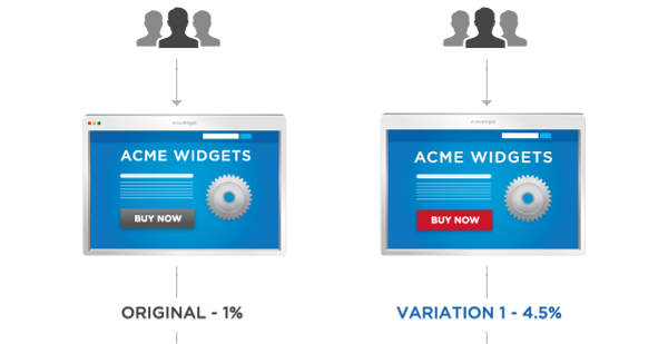
by Joe Lazauskas, from Inbound Hub – http://bit.ly/QID6gx
In 2014, the buzzword game has changed.
“Data” is the new “synergy.”
“Let’s A/B test it” is the new “Let’s circle back on that.”
Overall, this is a good thing. Synergy and circling back usually only result in the appearance of doing work, while intelligently testing techniques and generating actionable data actually helps you accomplish your business goals.
But the key word there is intelligently, since A/B tests are easier to mess up than the New York State bar. Two years ago, this blog published “7 Ways to Totally Screw Up Your A/B Testing,” but that two years is a long time in the marketing world. So long that people would still take you seriously when you talked about finding synergy in your gamification through SoLoMo.
To that end, here are five more A/B testing mistakes new marketers would be wise to look out for:
1) Blindly Optimizing for Conversion
Optimizing for conversion without considering the larger consequences and user experience can be a slippery slope. Let’s say, for example, that you’re a SAAS company and you’re testing two versions of your company’s “Story” page — the place where you want to tell the tale of your brand, and how it came to be.
One page has a brief, bullet-point list of company facts — Funded, Series A raised, etc. — followed by a giant TALK TO SALES button.
The other version of the page has a heartfelt personal history, such as this great story by Basecamp CEO Jason Friend, and just a small link to talk to sales in the footer.
I’d guess that the former page would drive more immediate sales prospects than the latter, and an inexperienced marketer might crown that version the winner. And in doing so, that marketer would be ignoring a lot of contextual facts. For starters, a visitor to a “Story” page isn’t likely looking for a hard pitch (they’d go to the About Us page for that). They’d also be discounting the impact that a great brand story can have, and it’s potential for that story to drive a conversion down the road. Finally, visitors might take away a negative perception of the company as cold and lacking personality.
But if you’re always laser-focused on conversion without context, this is an easy mistake to make — which leads to the next mistake on our list …
2) Creating the Test Before You Set Your Goals
An A/B test without a goal isn’t a test; it’s just screwing around with data. The same is true of when you set goals after creating and starting your test. Except this time, you’re trying to justify screwing around after the fact.
Always set your goals first. That way, you can actually create the test with your goals in mind. This may seem incredibly obvious, but when two versions of an idea pop into your head, it can be very tempting to just jump into a test willy nilly, which leads to unclear results.
3) Forgetting That There Are Other Letters in the Alphabet
An A/B test doesn’t have to just be an A/B test. It can be anything it wants when it grows up! An A/B/C test, for instance, or even an A/B/C/D/E test if you’re feeling particularly bold. When testing several different versions, just be sure that you have enough traffic to generate statistically significant results.
4) Ignoring More Advanced Metrics
As captured in the book and movie Moneyball, Oakland A’s GM Billy Beane revolutionized baseball and gained a tremendous competitive edge by eschewing traditional metrics for more complex and intricate stats. The same thing is happening in marketing and publishing.
Take testing the performance of branded content, for instance. Page views are a common benchmark for content performance, but if you’re not selling ads, they don’t make a whole lot of sense to measure. Instead, smart marketers look to conversion metrics, like social shares, contacts generated, or even how many site pages they visited.
Think about it. What would you rather have — 3,000 visitors who leave your content without doing anything, or 1,000 visitors who engage with your content? The latter is going to be much more valuable to you in the long run.
5) Failing to Separate Mobile and Desktop
This is the king of “Doy!” A/B testing moments, but one that still gets made. If you’re designing like it’s 2014, the mobile and desktop versions of your pages will look significantly different. (And even if they don’t, the user experience will still be different — probably because your user is busy throwing their smartphone against the wall in frustration.)
Mobile and desktop visitors to a particular site also exhibit different behavioral trends. If you lump them together, you’re going to have a hard time optimizing for either version of the page, and will very likely make a mistake with one or both. Use responsive design to ensure your posts are looking great on mobile, too, and optimize elements like form length, button size, and page copy to jive with a mobile reader’s experience.
Have you made any mistakes while A/B testing that adversely affected your results? Share them with below so we can learn from them, too!
