
By Jason Santa Maria, from A List Apart: The Full Feed – http://bit.ly/1noq547
I want you to think about what you’re doing right now. I mean really think about it. As your eyes move across these lines and funnel information to your brain, you’re taking part in a conversation I started with you. The conveyance of that conversation is the type you’re reading on this page, but you’re also filtering it through your experiences and past conversations. You’re putting these words into context. And whether you’re reading this book on paper, on a device, or at your desk, your environment shapes your experience too. Someone else reading these words may go through the same motions, but their interpretation is inevitably different from yours.
This is the most interesting thing about typography: it’s a chain reaction of time and place with you as the catalyst. The intention of a text depends on its presentation, but it needs you to give it meaning through reading.
Type and typography wouldn’t exist without our need to express and record information. Sure, we have other ways to do those things, like speech or imagery, but type is efficient, flexible, portable, and translatable. This is what makes typography not only an art of communication, but one of nuance and craft, because like all communication, its value falls somewhere on a spectrum between success and failure.
The act of reading is beautifully complex, and yet, once we know how, it’s a kind of muscle memory. We rarely think about it. But because reading is so intrinsic to every other thing about typography, it’s the best place for us to begin. We’ve all made something we wanted someone else to read, but have you ever thought about that person’s reading experience?
Just as you’re my audience for this book, I want you to look at your audience too: your readers. One of design’s functions is to entice and delight. We need to welcome readers and convince them to sit with us. But what circumstances affect reading?
Readability
Just because something is legible doesn’t mean it’s readable. Legibility means that text can be interpreted, but that’s like saying tree bark is edible. We’re aiming higher. Readability combines the emotional impact of a design (or lack thereof ) with the amount of effort it presumably takes to read. You’ve heard of TL;DR (too long; didn’t read)? Length isn’t the only detractor to reading; poor typography is one too. To paraphrase Stephen Coles, the term readability doesn’t ask simply, “Can you read it?” but “Do you want to read it?”
Each decision you make could potentially hamper a reader’s understanding, causing them to bail and update their Facebook status instead. Don’t let your design deter your readers or stand in the way of what they want to do: read.
Once we bring readers in, what else can we do to keep their attention and help them understand our writing? Let’s take a brief look at what the reading experience is like and how design influences it.
The act of reading
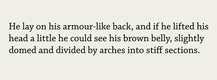
When I first started designing websites, I assumed everyone read my work the same way I did. I spent countless hours crafting the right layout and type arrangements. I saw the work as a collection of the typographic considerations I made: the lovingly set headlines, the ample whitespace, the typographic rhythm (fig 1.1). I assumed everyone would see that too.
It’s appealing to think that’s the case, but reading is a much more nuanced experience. It’s shaped by our surroundings (am I in a loud coffee shop or otherwise distracted?), our availability (am I busy with something else?), our needs (am I skimming for something specific?), and more. Reading is not only informed by what’s going on with us at that moment, but also governed by how our eyes and brains work to process information. What you see and what you’re experiencing as you read these words is quite different.
As our eyes move across the text, our minds gobble up the type’s texture—the sum of the positive and negative spaces inside and around letters and words. We don’t linger on those spaces and details; instead, our brains do the heavy lifting of parsing the text and assembling a mental picture of what we’re reading. Our eyes see the type and our brains see Don Quixote chasing a windmill.
Or, at least, that’s what we hope. This is the ideal scenario, but it depends on our design choices. Have you ever been completely absorbed in a book and lost in the passing pages? Me too. Good writing can do that, and good typography can grease the wheels. Without getting too scientific, let’s look at the physical process of reading.
Saccades and fixations
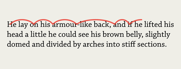
Reading isn’t linear. Instead, our eyes perform a series of back and forth movements called saccades, or lightning-fast hops across a line of text (fig 1.2). Sometimes it’s a big hop; sometimes it’s a small hop. Saccades help our eyes register a lot of information in a short span, and they happen many times over the course of a second. A saccade’s length depends on our proficiency as readers and our familiarity with the text’s topic. If I’m a scientist and reading, uh, science stuff, I may read it more quickly than a non-scientist, because I’m familiar with all those science-y words. Full disclosure: I’m not really a scientist. I hope you couldn’t tell.
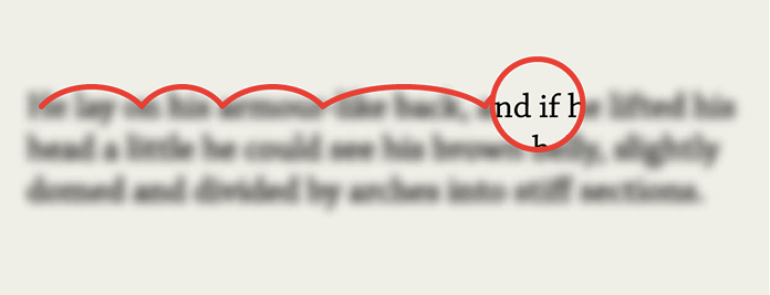
Between saccades, our eyes stop for a fraction of a second in what’s called a fixation (fig 1.3). During this brief pause we see a couple of characters clearly, and the rest of the text blurs out like ripples in a pond. Our brains assemble these fixations and decode the information at lightning speed. This all happens on reflex. Pretty neat, huh?
The shapes of letters and the shapes they make when combined into words and sentences can significantly affect our ability to decipher text. If we look at an average line of text and cover the top halves of the letters, it becomes very difficult to read. If we do the opposite and cover the bottom halves, we can still read the text without much effort (fig 1.4).
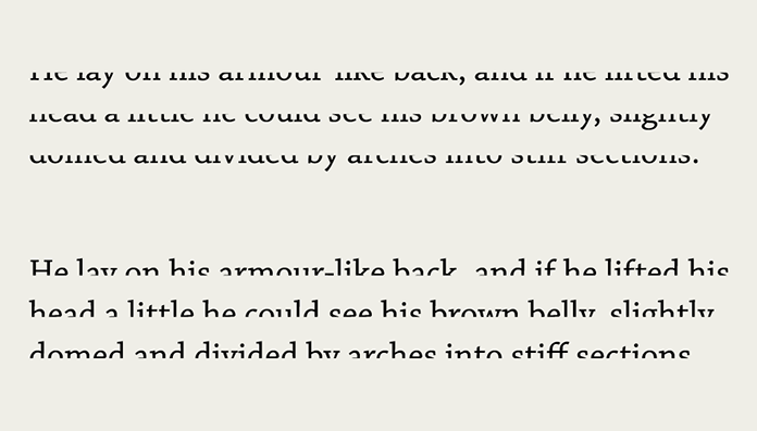
This is because letters generally carry more of their identifying features in their top halves. The sum of each word’s letterforms creates the word shapes we recognize when reading.
Once we start to subconsciously recognize letters and common words, we read faster. We become more proficient at reading under similar conditions, an idea best encapsulated by type designer Zuzana Licko: “Readers read best what they read most.”
It’s not a hard and fast rule, but close. The more foreign the letterforms and information are to us, the more slowly we discern them. If we traveled back in time to the Middle Ages with a book typeset in a super-awesome sci-fi font, the folks from the past might have difficulty with it. But here in the future, we’re adept at reading that stuff, all whilst flying around on hoverboards.
For the same reason, we sometimes have trouble deciphering someone else’s handwriting: their letterforms and idiosyncrasies seem unusual to us. Yet we’re pretty fast at reading our own handwriting (fig 1.5).
There have been many studies on the reading process, with only a bit of consensus. Reading acuity depends on several factors, starting with the task the reader intends to accomplish. Some studies show that we read in word shapes—picture a chalk outline around an entire word—while others suggest we decode things letter by letter. Most findings agree that ease of reading relies on the visual feel and precision of the text’s setting (how much effort it takes to discern one letterform from another), combined with the reader’s own proficiency.
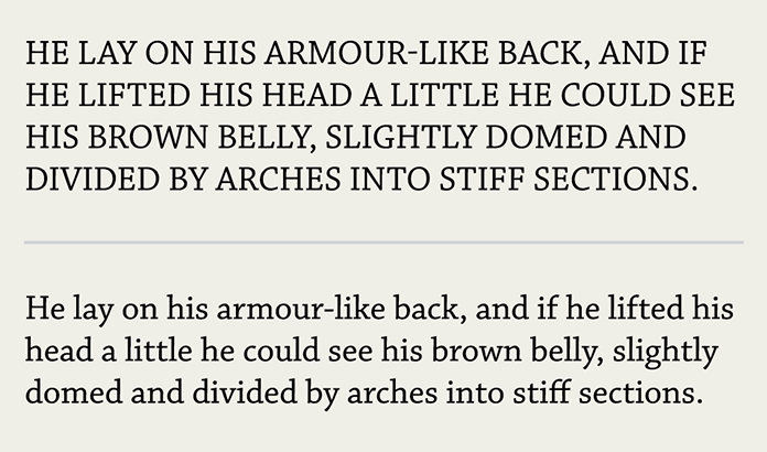
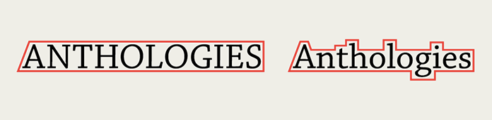
Consider a passage set in all capital letters (fig 1.6). You can become adept at reading almost anything, but most of us aren’t accustomed to reading lots of text in all caps. Compared to the normal sentence-case text, the all-caps text feels pretty impenetrable. That’s because the capital letters are blocky and don’t create much contrast between themselves and the whitespace around them. The resulting word shapes are basically plain rectangles (fig 1.7).
Realizing that the choices we make in typefaces and typesetting have such an impact on the reader was eye-opening for me. Small things like the size and spacing of type can add up to great advantages for readers. When they don’t notice those choices, we’ve done our job. We’ve gotten out of their way and helped them get closer to the information.
Stacking the deck
Typography on screen differs from print in a few key ways. Readers deal with two reading environments: the physical space (and its lighting) and the device. A reader may spend a sunny day at the park reading on their phone. Or perhaps they’re in a dim room reading subtitles off their TV ten feet away. As designers, we have no control over any of this, and that can be frustrating. As much as I would love to go over to every reader’s computer and fix their contrast and brightness settings, this is the hand we’ve been dealt.
The best solution to unknown unknowns is to make our typography perform as well as it can in all situations, regardless of screen size, connection, or potential lunar eclipse. We’ll look at some methods for making typography as sturdy as possible later in this book.
It’s up to us to keep the reading experience unencumbered. At the core of typography is our audience, our readers. As we look at the building blocks of typography, I want you to keep those readers in mind. Reading is something we do every day, but we can easily take it for granted. Slapping words on a page won’t ensure good communication, just as mashing your hands across a piano won’t make for a pleasant composition. The experience of reading and the effectiveness of our message are determined by both what we say and how we say it. Typography is the primary tool we use as designers and visual communicators to speak.