

By Lindsay Kolowich, from Inbound Hub – http://bit.ly/1kqmdDD
Landing pages are the core of the conversion process. They are one of the best ways you can convert website visitors into leads and leads into customers. But a high-converting landing page isn’t just a random form, a little description, and a kind-of-related image thrown together onto a web page – you have to build each component thoughtfully and strategically.
To get people to convert on your website, the conversion process needs to be a) easy, and b) enjoyable. The key is keeping visitors on your page long enough to get them to fill out your form, which means clean formatting, concise language, and a compelling offer.
But it’s not as easy as it sounds. There are a lot of really awful landing pages out there. To help you convert as many visitors as possible into leads, here is a comprehensive look at the things you shouldn’t do on your landing pages — and how you can fix them.
The 12 Ways You Can Totally Screw Up Your Landing Page
1) It takes more than a second or two to load.
Did you know that 40% of people will abandon a website that takes more than three seconds to load? That means you will lose 2 out of every 5 people who come to your landing page before you even have a chance to show them what you’ve got. Fast page load times means better user experience and it helps your Google search ranking.
How to Fix It:
Catch the problem early by monitoring your page load times and fixing them as soon as you notice they’re slow. Learn how to monitor and improve your page load time here.
2) The design is cluttered.
Layout is a critical factor in how your landing page will perform. Website visitors judge the value of your offer in the first few seconds they spend on the landing page. We call this the “blink test,” which refers to the first three to five seconds a website visitor spends on any page of your website, during which they orient themselves and figure out what they can do on that page. If your landing page is wordy, lacking any images or colors, or jam-packed with way too much information, visitors won’t know where to focus their attention and may end up clicking away.
How to Fix It:
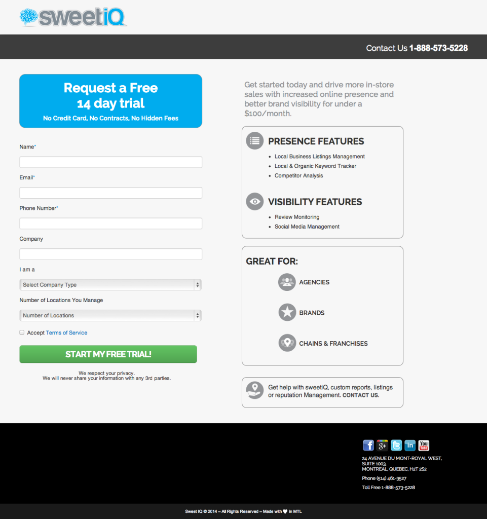
Simplicity is the key to landing page design. Design your landing page to look clean and simple with a decent amount of white space. Include a color theme that’s easy on the eyes, including a single call-to-action button that stands out. Write a clear headline and include an image or video that communicates the value proposition of the offer.
Check out this great example from SweetiQ:
3) It’s missing your company name or logo.
When a website visitor arrives on a landing page, it should be very clear to them not only what the offer is, but also which company published it. By excluding your company name and logo, the visitor might wonder where the offer is coming from so she knows it’s credible, which can really distract her from the offer itself. Remember, visitors may not be arriving at your landing page from your company’s website: others might get to it from external sources or via social media.
How to Fix It:
Your logo doesn’t need to be a focal point, but it needs to appear somewhere on your landing page. People are used to seeing logos at the top left-hand or right-hand corners of webpages, so putting it there is intuitive to the viewer. (Remember, you’re trying to make it easy for them.) No matter where you choose to put your logo, make sure it’s consistent on every one of your web pages.
4) There are menu and navigation links.
On most parts of your website, having a navigation bar is key to delivering a solid user experience — but on your landing page, they’re generally more trouble than they’re worth. They guide people to different pages on your website while you’re trying to get visitors to focus on the offer so they fill out the form. Links to other parts of your site are a distraction you can avoid by simply not putting them in there.
How to Fix It:
Take off the menu and those navigation links immediately (here’s a quick tutorial on how to do that). In fact, take all links off your landing pages except social sharing icons, which allow visitors to share your offer on social media but do not direct visitors away from the page.
5) You’ve got social following icons.
Social following icons (different from social sharing icons) are buttons that send visitors to your company’s Twitter, Facebook, LinkedIn, and Pinterest pages. They’re dangerous because they direct visitors away from your landing page — and they may never come back to fill out your form.
How to Fix It:
It’s simple: Remove ’em!
6) Your header is bland or super long.
The header of your landing page is usually the first thing a visitor sees. It’s your opportunity to tell visitors what they’re getting and how they’re getting it, and to create a sense of excitement and urgency about the offer. A headline is bad when:
- It’s not detailed. Without some explicit information on what exactly people will be able to get after filling out the form, your website visitors aren’t going to give over their information.
- It’s long and wordy. You’ll lose the reader after the first few words.
- It doesn’t sound human. It’s easy to get caught up in our own industry jargon, but terms that seem normal to you may be totally foreign to the people you want to convert on your landing page.
How to Fix It:
Try starting the headline with the simplest explanation of what your offer is. For example, if it’s a guide to help you put together blog posts quickly, you should start your title with, “Free Guide.” Then, use non-jargony terms to describe your offer in the most enticing, yet concise way possible. So back to the example — the headline would read something like this: “Free Guide: How to Write Better Blog Posts in 30 Minutes a Day.” It’s short, simple, and jargony free, all while communicating the value of filling out the landing page form.
7) Your supporting copy is in paragraph form.
The supporting copy is the part of a landing page that details the benefits of the offer below the headline. If yours is in paragraph form and reads kind of like a blog post, many visitors won’t even read it because it doesn’t appear skimmable.
Bad supporting copy is lengthy and dense, detail unspecific benefits, and take a while to get to the point. They say “It’ll save you money,” rather than “I’ll save you $600/year on car maintenance.”
How to Fix It:
The supporting copy is your chance to persuade your website visitor that your offer will benefit them — but you have to do it succinctly. It should consist of the following:
- What the offer is (1-3 sentences)
- How the offer will benefit the person filling out the form (3-5 bullet points)
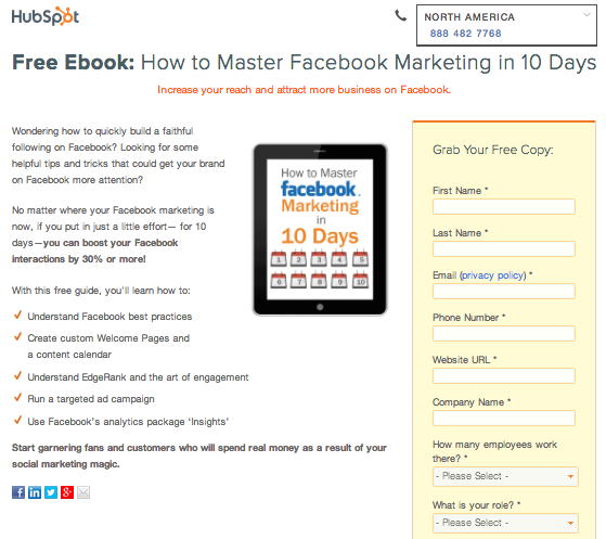
Use bullet points, numbers, and bold text so the content is easily scannable. The clearer the value and the faster someone can look at the landing page and take away that value, the more likely they’ll fill out the form. Check out an example from one of our landing pages to see how you can better format your supporting copy.
8) The image doesn’t totally match the offer.
On landing pages, the phrase, “a picture’s worth a thousand words,” can definitely hold true. But not just any image will do. If you’re offering an ebook about changing the oil in your car, don’t just slap on a picture of someone changing the oil on the car. At first glance, your visitor doesn’t know what the offer is without reading the headline. Are you offering 50% off their first oil change? Or a checklist of tools they need to change their oil? The image makes it unclear.
How to Fix It:
Anyone should be able to look at your image and be able to tell exactly what the offer is. If you’re offering an ebook, include an image of the ebook’s cover. If you’re offering a free trial, include a screenshot of a tool in the software. If you’re trying to get registrants for a webinar, add an image of the title slide or a picture of the presenter overlaid with some explanatory text.
You could also try using video instead of an image if you have the time and resources. On the right landing page, they could make an impact on conversion rate — and it’s an easy way to boil down a lot of information into a small space. (Want to make a marketing video, but don’t know where to start? Learn how to make one here.)
9) Your form has too many fields, or the wrong kind.
Choosing the right number of fields — and the right kind of information you request in those fields — requires some strategy. The number of fields and the information you ask for should mirror the value of your offer. So, if you’re offering a one-pager, don’t ask for job title, number of employees at the company, and biggest business challenge — many of your visitors are probably not willing to share that information for such a light offer. In that case, you’d want to just ask for name, email, and maybe company name.
How to Fix It:
When you’re figuring out how long to make your form and what to ask, think about two things. First, ask yourself this question: would you rather have more leads that are lower quality, or fewer leads that are higher quality? It’s a tradeoff — the shorter the form, the more people will probably be willing to fill it out, so you’ll generate more leads overall. But visitors who are willing to fill out longer forms with more information about themselves are probably going to be higher quality leads.
Next, think about what information people would be willing to share to get that offer. Where does the offer align with where the visitor is in the buying process? If they’re signing up for a free trial, they’re probably willing to give you their company name, number of employees, and information about business pain points. At that stage, they know who your company is and they trust you more than first-time visitors to your website.
(HubSpot customers: take advantage of the Smart Fields feature — it recognizes people who have already converted on another of your offers, automatically removes fields these people have already filled in, and replaces them with new fields of your choice. It means a better experience for the visitor and it gets you the information you hope to better qualify them as a lead.)
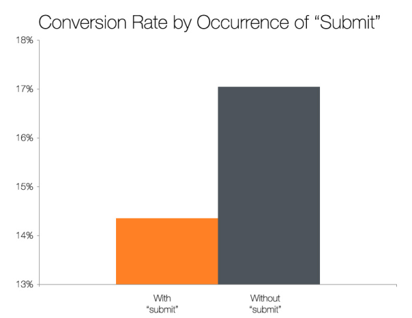
10) Your form submit button just says “Submit.”
Customizing your “submit” button copy is one of those small changes on your landing page that can make a big difference. A study of our own 40,000 HubSpot landing pages showed that CTAs including the word “submit” performed significantly worse than CTAs without the word “submit.” So take the extra 30 seconds to change the copy — it could help increase conversion rates.
How to Fix It:
The wording on the submit button should be concise and action-oriented — very similar to your headline. Change “submit” to something like “Download My Free Ebook” and “Get My Free Consultation.”
11) It lacks social proof.
Don’t make visitors take your word for it. People tend to do what other people are doing. In Marketing, this is called social proof, and it helps build trust with people who don’t know your company well. You don’t need social proof on your landing pages, but without it, you miss out on the chance to convert the skeptics.
How to Fix It:
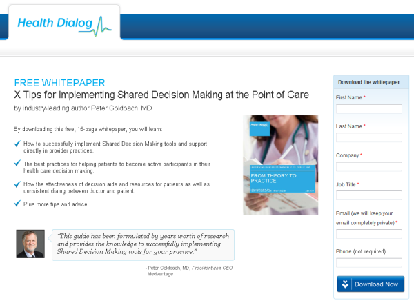
Use quotes from people who have praised the offer, and include their name, picture, and job title if possible. You can also try embedding tweets and Facebook social plugins to show feedback in real time, or include the number of people who have downloaded the offer so far. Here’s an example of how a company used social proof on one of their landing pages:
12) It’s not mobile-friendly.
Filling out forms on your phone is the worst. I know that feeling of dread when realize you have to type in your entire email address to the tiny keyboard on your phone. If your landing page isn’t mobile-friendly, then your form will be too tiny to read, and people will get frustrated trying to fill it out. You risk having them bounce off your site now that mobile-friendly websites are such a given.
How to Fix It:
First, check out what your landing pages look like on mobile devices by heading over to HubSpot’s Device Lab and inputting the URL of your page. It’ll show you exactly what it looks like on a phone, tablet, and other devices.
Next, make sure your landing page is responsive to devices other than desktop computers so that people can fill out your form no matter what device they’re on.
How else do you think people mess up their landing pages? Leave your thoughts in the comments.