By Marc Schenker, from Webdesigner Depot – http://bit.ly/1sbrv8d
Email continues to be one of the most popular ways that companies interact with their customers. As with everything else in the design world, how you design an email will have a tremendous impact on things like the click rate and the retention of your subscribers.
When you design for email, you should make the most of the fleeting opportunity you have to make an impression on your subscribers. One of the Cialdini principles of persuasion applies here: if you offer your readers great value through your email, they’ll gladly reciprocate by taking the time to read through and click on any links.
Of course, designing for email also entails responsive email design since almost half of all email opens today occur on a mobile device. Here are the can’t-miss components of successful email design.
1) Transparency counts
Double-check the kinds of subject lines, copy, sender names and even preheaders that you use. Never make any of these ambiguous or confusing for your readers. Otherwise, they’ll be so much likelier to mark your emails as junk or outright delete them.
Instead, always tell your readers your identity, what they’re reading and what the benefits of reading will be. The trick is to get all of this information as close to the top of your email as you can. Having all this information stare your readers in the face as soon as they open your email means your proposition won’t be ignored.
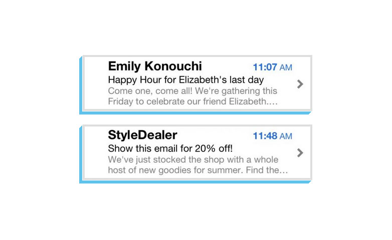
This example shows two emails where the sender name’s in a huge font, the subject line’s crystal clear and the benefits of reading are staring the subscriber right in the face.
2) Follow a conventional pattern
This is the one time when being conventional and not doing something unexpected helps your cause. People are going to expect certain commonalities in all emails they open. For instance, when designing for handheld devices, be sure to make big as well as easily clickable and tappable buttons for your links. It’s best to even make them 100% of the width of the screen because users want to tap with either thumb!
If you place additional links in the copy of your email, make sure that they appear in contrasting and bold colors to make them stand out and scream for attention. Never put links too close together since it would be annoying if users accidentally tap the wrong link.
Finally, see to it that you also make the advantages of clicking so obvious that they can’t be missed. A good way of achieving this is to combine the advantages of a click with the button itself. For example, ideal button copy would be “get your free demo now.”
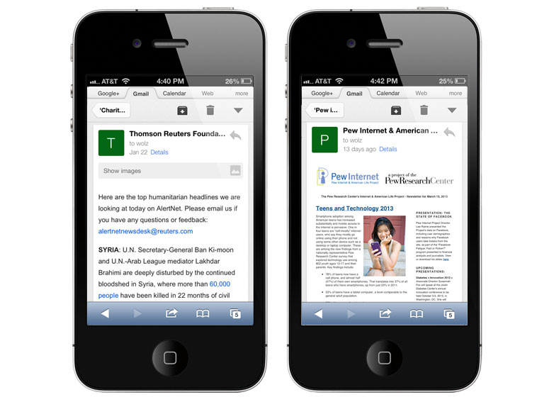
Here’s a good example of using bold colors in email links to get the attention of readers.
3) Minimalism: say more with less
No one makes time to read that much, especially mobile users, so don’t write a lot in your email copy. Readers will simply scan the email for stuff that holds their interest instead of reading the entire email word-for-word. Split up the chunks of text into small pieces that are easier to consume.
A marketing email, for example, has the objective of getting readers to click back to your website. Don’t stall this intended outcome with a long piece of text. At any rate, longer text just makes it so much more tempting for readers to send your email to the trash.
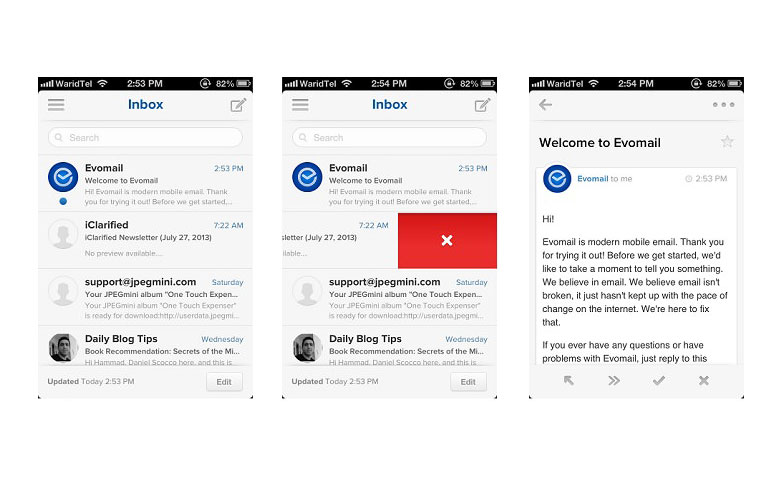
See these examples of how minimalist emails appear in Evomail.
4) Promote scan-friendly reading
Readers love to scan emails, so make them easy to scan. You’ll accomplish this by dividing your text into delineated and orderly chunks that get right to the point. The use of crystal-clear headings and the emphasis of significant concepts in bold will empower your scanning subscribers to get to the gist straightaway.
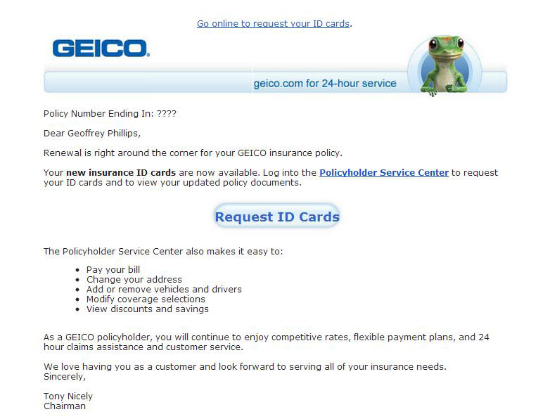
Geico’s transactional email illustrates scan-friendly emails to the hilt.
5) Say as much as you want, just later on
Design your email copy so that the most gripping and shorter details come first; only include your longer content after that. This way, you aren’t making any of your readers slog through the longer content, save for the ones who really want to read the longer content. So there is a place for longer content in email marketing, but it just has to come in the right place in the email.
6) Reiterate the call to action
In marketing emails, the call to action is the whole reason for sending your readers the email to begin with. It therefore pays to repeat the call to action later on in the email, particularly if your email has longer content. No one wants to scroll all the way back to the beginning of the email to see the call to action again.
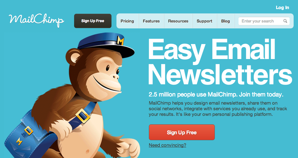
MailChimp’s email repeats its call to action at the top and then again at the bottom.
7) Limit the number of choices
An excess of choices in your email will cause a cognitive overload on your subscribers, so they’ll be that much less likely to actually go ahead and make a decision. Ponder carefully over just what the minimum requirement would be to get a reader to click to go to your site. You want to just gradually introduce this necessary detail to the reader. If you give him too much information at the beginning, then he’ll be likelier to abandon his task.
8) Rely on that whitespace
Whitespace is very effective even in email design. Whitespace is highly useful when it comes to breaking apart crucial bits of information to make it easier for the reader to absorb important details. If you’ve got a lot of elements that are the same size as well as weight, then incorporating whitespace allows readers’ eyes to focus on the stuff that matters. Without whitespace, your email body can appear as a formless, huge block that readers may just skip over.
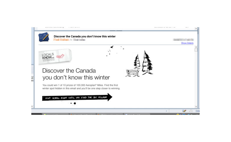
Here, you can see how whitespace focuses the reader’s attention to the marketing message.
9) A special word on responsive email design
Today, people are looking at their mobile devices around 150 times a day! In addition, 4 out of 5 people will delete emails if they fail to look good on their mobile devices. All this means that you have to focus more intently on bringing your message across to your readers more efficiently than ever.
The media query @media is used in responsive email design. @media is a unique set of CSS styles that behave like either dynamic rules or conditional statements. They can help you create emails that are more readable on various screen sizes.
What they do is identify a device’s screen size and then various sets of rules that apply to said screen size. Based on specifically what you want to accomplish, media queries may be easy or hard to implement. Note that these won’t work in all email clients and also need more planning as well as testing than ordinary emails.
Based on your specific screen size, media types define the exact CSS styles to utilize. Essentially, this media type says, if your email’s viewed on a screen size that’s 480px or smaller, use the following CSS.
So that would be: @media screen and (max-width: 480px)
Responsive email support
Currently, not all handheld devices and clients support responsive email. That’s why designers must keep abreast of what devices and clients support responsive email. That’s why it’s a really good idea to actually test your emails out in a bunch of different devices and clients, so that you can be sure.
Here is where responsive emails are currently supported:
- Android 4.x Email OEM app
- iOS Mail app
- Windows Phone 7.5
- BlackBerry Z10
- BlackBerry OS7
Here is where responsive emails are currently not supported:
- Android Gmail app
- iPhone Gmail app
- iPhone Yahoo Mail app
- iPhone Mailbox app
- Blackberry OS5
- Android Yahoo Mail app
- Windows Phone 7
- Windows Phone 8
- Windows Mobile 6.1
10) Design email for readers
As with all other aspects of web design, the job of designers is to design for the user in order to enhance the user experience. That has to be priority number one. Otherwise, your emails won’t be a big hit with your readers and subscribers.
There are so many things to consider, everything from transparency and following a conventional pattern to minimalism and whitespace. If you want to reach folks on mobile, you have to also figure in responsive email design. Keeping these tips in mind will greatly help with your email click rate.

