
By Will Yakowicz, from Inc.com – http://bit.ly/1ip9n1F
When you need to convey dense data or an important message, your best bet may be to create an easy-to-digest visual.
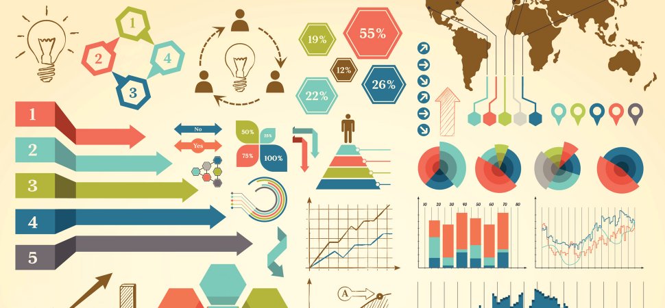
Do you have a complicated message packed with dense data, an enlightening set of facts, or a powerful message you want to communicate with your customers? If you’re not using them already, you need to start producing infographics.
In an interview with the Harvard Business Review, Gareth Cook, a Pulitzer Prize-winning journalist and the author of The Best American Infographics 2013, explains the power of infographics. In business, he says, they should be used to help your customers understand facts, get them to realize the importance of a certain cause, make them laugh, or enlighten them by connecting seemingly unrelated relationships.
Below, check out the three ways Cook says your company can use infographics to better present data to your customers.
Convey a powerful emotion.
A pie chart, a graph, or a PowerPoint presentation will not elicit an emotional response from your customers. But Cook says that by their nature, infographics do. “Infographics have an emotional power because they can show you an idea–or a relationship, or how something works–very quickly. People respond to that,” Cook tells HBR. “A persuasive infographic surprises the viewer. It moves them in some way and makes them want to keep looking at it or show it to other people.”
Shine light on one important fact.
While compiling the best infographics of last year, Cook says a few similarities appeared. Most of them had a laser focus on one important point or fact. This type of focus is important to brands, especially when they’re trying to communicate a complicated message. “First, I’d say, they all have a clear focus. The designer has gone in and removed all the extraneous details so you see just what you need to understand the message behind it. And yet the best ones also have a kind of openness–the person who has done it is transparent about what data they’re using,” Cook says. “That can be tricky because you need to give people a sense of all the data that’s out there, and enough context, without overwhelming them. In the best cases, viewers feel that they are the ones stepping in and making the connection because they can see the bigger pattern naturally emerging from what you’re showing them.”
Humor can convey a serious message.
Infographics can help your message get more mileage if you make the viewer smile. “I think it’s often the case that when people are designing something to persuade, they forget the importance of whimsy. Humor opens people up and makes them more willing to hear messages they might…otherwise reject out of hand,” Cook says. “When you’re working really hard on designing something or making something clear, it’s very easy to lose that sense of fun yourself, and the work shows it. You want your audience to sense that at a certain level you are enjoying this. A lot of the pieces in this collection just make me smile.”
Also included in Cook’s book are 10 examples of interactive infographics, a type that can range from cutaway diagrams to video. Below, watch a video that brings to light the issue of carbon emissions in New York City by depicting each ton of carbon dioxide as a blue ball.