By Tammy Guy, from UX Magazine – http://bit.ly/1j44PFB
The overall presentation of a site must be clean and professional in order to gain user’s trust. Consistent and easy-to-use interfaces help users concentrate on the content and flow through the rhythm of browsing. In e-commerce, when that rhythm stops due to any uncertainties, it can deter users who will in turn defer back to in-store or phone help—or give up on a business transaction all together.
I recently made an in-store purchase at Old Navy and opened up a credit card there. My store experience was very good; I was greeted by friendly face who told me all about the current sales and took me through a speedy card application process.
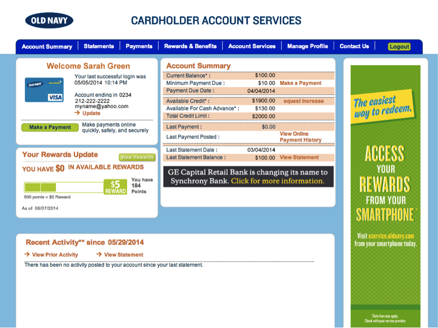
That experience was quickly uprooted and overturned, however, when I received my statement in the mail. Signing in to my online account, I immediately felt concerned that I was late with my payment. Trying to sift through the overwhelming amount of information, I had to work harder than necessary in order to get some answers.
Users have Physiological Reactions to Layouts
Crowded user interfaces, inconsistent styles, and unbalanced compositions will effect users’ interactions and alter their overall experience.

In the case of Old Navy’s account summary page, I had the following reactions:
- The orange/red grid lines and links immediately made me feel I did something wrong.
- The tight page grid, small copy, and lack of white space made me feel constrained, as if I was holding my breath while trying to make sense of the information.
- Being “directed” by red color to the Account Summary on the right, I was left disoriented having to scan from right to left. I felt uncertain about what my next step should be.
(Note: all personal information has been replaced with sample content.)
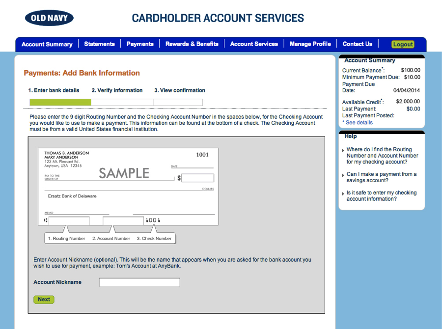
Next, I clicked on Make a Payment and was faced with the task of adding my bank account information. What I thought would be a simple task, quickly made me feel irritated.

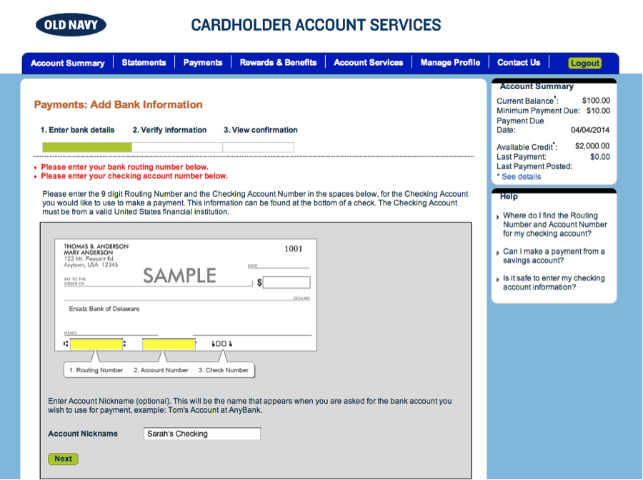
While I noticed the Account Nickname form field immediately, I completely missed the additional required fields on the page and received an error message once submitting the form. The Routing, Account and Check Number fields were uniquely placed in a banner format design versus a typical form presentation.

The rhythm was broken again. While this out of the box presentation is unique, it is violating existing global usability guidelines and in turn “hiding” important form elements. It would have been so much more simple and cleaner to present three form fields on the page with a tool tip icon for those of us who often confused between the routing and account numbers.
Rhythm helps users move forward and make progresstweet this
Rhythm helps users move forward and make progress. When designing web sites, picture your users sitting in front of their laptops listening to their favorite tunes. They are browsing, scanning, and moving forward—help them keep moving forward by removing obstacles from your pages to present seamless experiences.
Send us your samples of when and where your rhythm was stopped and how it affected your overall experience.
Image of Indian percussion artists courtesy Shutterstock.
