By Helga Moreno from InstantShift – http://bit.ly/1rDTkCM
Bookworms are referred symbolism to the late nineteenth-century art movement. It began spreading through Russia, France and Belgium as kind of protest against naturalism and realism in favor of spirituality, imagination and dreams. Sounds beautifully, isn’t it? The term “symbolism” has derived from the word “symbol” which, in its turn comes from the Latin ‘symbolum’, a symbol of faith, and ‘symbolus’, a sign of recognition.
Symbolism in Web Design and its Impact on Users’ Perception
Symbolism is related to the gothic component of romanticism. In painting, symbolism can be seen as a revival of some mystical tendencies in the Romantic tradition, and was close to the self-consciously morbid and private decadent movement.
Symbolism is concentrated on visual signs, so symbols can be used instead of words and people will still understand what is at stake. Sometimes, symbols are even more powerful than words.
Symbolism in Web Design
Symbols affect reader’s perception much more than plain text, so they are widely used by designers. Nowadays it’s impossible to find a single website without symbols. They are everywhere! And it doesn’t matter what kind of site it is: either a music top chart, or charity organization, or restaurant, or online shop and so on, this list can be continued ad infinitum.
So why is symbolism so common on the Internet? The answer is simple as a pie – because of the powerful effect of symbols on human perception. It is a scientifically proven fact that our brain processes visual signs much faster than textual information. Moreover, common symbols (which we got used to see every day) have even more “strength” than words. Let’s give you a vivid example of symbols’ power. Say, you see the radiation symbol. You don’t need to read anything; you immediately understand that your health is in danger as you spotted a radioactive area or came close to a radioactive object. And even when you notice a message persuading you that the place is clean and safe next to the sign will you trespass? What will you believe? The message or the sign? Most likely you’ll refrain from crossing the line. Why? Because images look much more convincing than words.
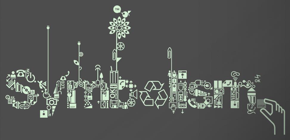
It’s impossible to characterize all kinds of signs used in web design. That’s why we’ll focus on icons. Icons are probably most frequently used signs in web design. Developers utilize them not only in designs, but also computer programs. Icons may completely replace words and even sentences or make combinations with them. For instance, you don’t have to type “launch my favorite game”. It’s enough just to click its icon on your desktop. Quickly and easy, isn’t it? That is the reason why icons (signs, symbols) are so common. Icons save a lot of our time because their design becomes more and more intuitive, so we understand such simple visual presentation much faster than words. All stuff that improves user experience is highly appreciated by web designers, after all, they create for the users and their opinion and convenience is utterly important. Besides, icons help to save the design from clutter. They are small, but can easily replace loads of text making websites clean, simple and easy to understand. Icons can be called a kind of tool for designer’s expression and user’s interaction with the application.
Of course, the world of web design moves forward and old things go out of fashion while the new tricks appear on the scene. The same evolution happens to icons. They can’t stay aside as icons, like all other UI elements should blend with modern layout. As time goes by, web trends move towards minimalism, simplicity, purity, and flat, futuristic layouts. There is no any intrigue in fact that today flat design thrives and can be seen absolutely everywhere, including icons, of course. In addition to minimalist, flat icons, the outlined, sketchy ones are also on the peak of popularity. The skeuomorphic ones lost their garland at last and developers took their chance to turn virtual reality into a better world that follows its own laws and is not a reflection of reality all of us exist. Don’t you think that it’s rather daring to separate the two worlds, however, nothing ventured nothing gained. And now we have a place to escape to when we feel sad, tired or vice versa when we are on the seventh heaven and need to share the feeling with the world. Speaking about icons, we couldn’t help mentioning the ones that cast the long shadows. The trend appeared in 2013, but it looks as if it is not going to stay for diner. So, what icons to use to make your website look stylish and contemporary? We would recommend a mixture of everything mentioned above.